Redesign - Analytics Dashboard
The analytics dashboard is the landing page for all merchants. This page needs to provide quick, insightful data to help small and medium sized businesses stay on top of their business.
.png)
CLIENT
Elavon
ROLE
Lead Designer
TIMELINE
8 weeks
Overview
So, what are we working with?
.png)
The analytics dashboard has 2 data visualizations and is otherwise overly text-heavy. We need to research what data points are relevant and important to our users, and make room for more visualizations to fit above the fold.
The colors present are unbalanced and do not provide a delightful experience.
The dashboard is not screen responsive which is both an accessibility issue as well as a poor user experience.
Our focus: increasing the value brought to merchants, resolving accessibility issues, and delighting the user in the process.
Competitive Analysis
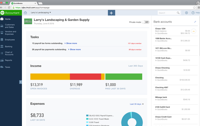
Visual trends: bright colors, responsive grid design, squares containing individual data highlights
Data points: deposits, top sale items, invoices, expenses
Clean, sans-serif fonts
What can we learn?
"Good design is about process, not product."
- Jared Sinclair
Ideation + Testing
I held a design session where we explored grids, sizing, different metrics and data points.
Once we had two ideas flushed out, I set out to test them with users.
I created wireframes to test and created a UserTesting.com session to get feedback and user insights.


.png)
Main questions
1. How quickly can users digest the data?
2. Do users understand what they can do?
3. Do users respond well to the layout?
Findings
Data is easier for users to digest when there is less in each block.
Users understand that they are looking at an overview of the business, with real-time updates and flexible time frames.
Grouping relevant data together improves clarity.
User research and testing keeps the customer as the centerpiece of the design and experience
Final(ish) Design
.png)
As a user experience designer, the research and design review process is never over. We continue to gather feedback from our users through surveys and customer interviews, and are constantly exploring new ways to improve our analytics dashboard.


